
CASE STUDY
Omika Health
Designing clarity for complex health information
Omika Health is an early-stage health startup using DNA screening and AI to support earlier disease detection. I was brought in as a freelance Interaction Designer to design both the marketing website and a companion web application while the product was still evolving.

My Role:
Sole UI/UX designer

Period:
Oct 2024 - Mar 2025
The Challenge
Unlike a traditional UX project, Omika was still defining both its product and business direction.
This meant requirements changed throughout the project, there was no established product roadmap, and design decisions often helped shape the product itself.
Instead of designing from detailed specifications, I needed to balance business goals, technical constraints and usability while working in an environment of constant iteration.
CONSTRAINTS
🚀 Early-stage startup
✏️ Product still being defined
📋 Limited initial requirements
👥 No direct access to end users
⏳ Tight project timeline
🎨 Existing branding already established
DESIGN APPROACH
Lean UX
Why Lean UX?
A traditional discovery-heavy UX process would have slowed the project and quickly become outdated.
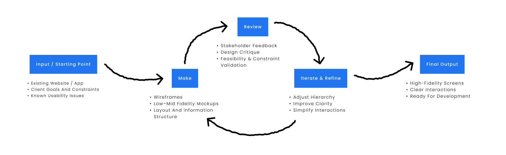
Validation was based on iterative stakeholder feedback due to project scope and timeline.
WebSite
Goals

Guide visitors

Explain the service
The goal of the marketing website was to introduce Omika's mission, explain DNA screening, and encourage visitors to learn more about the service.

Build trust
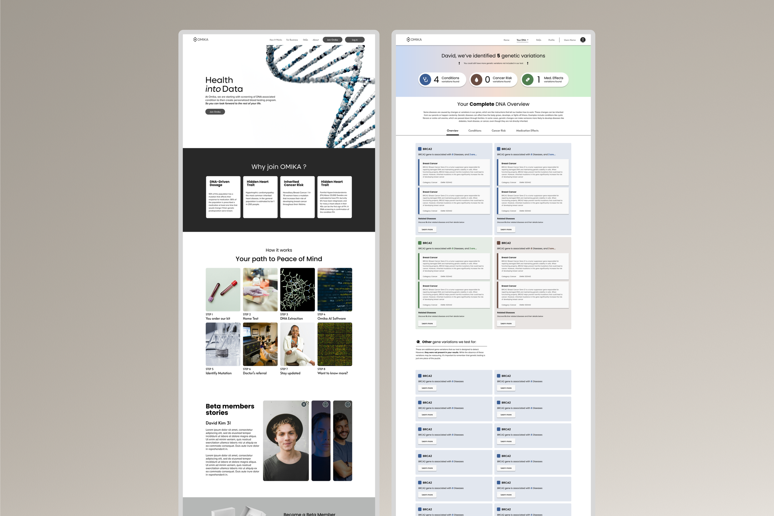
PROJECT 1
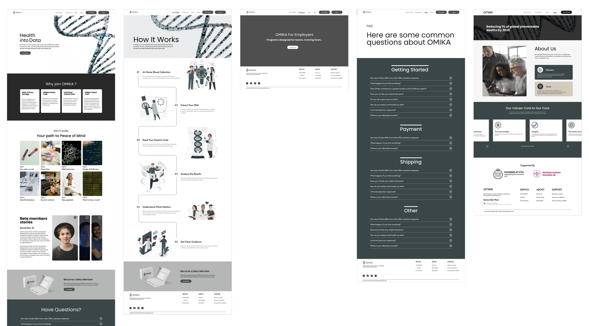
Pictured above: a quick glance of the home page, How it works, For business, FAQ, About us Omikas new website.
KEY DESIGN DECISIONS


Accessible by Design
Prioritized WCAG principles and universal design through high-contrast colour combinations, clear typography, and consistent navigation to improve readability for all users.
Information Architecture
Structured the website to clearly communicate who Omika is, how the service works, and what the company offers through a logical information hierarchy.


Stakeholder-Driven Design
Used low-fidelity wireframes to rapidly validate ideas with stakeholders before refining the experience into higher-fidelity designs.
Brand Consistency
Applied Omika's established visual identity while improving layout consistency, readability, and usability across the website.
WebApp
Goals

Present DNA results

Reduce complexity
The goal is to Design a web application that transforms complex DNA results into a clear, approachable experience, helping users understand their results without feeling overwhelmed.

Visual clarity
PROJECT 2
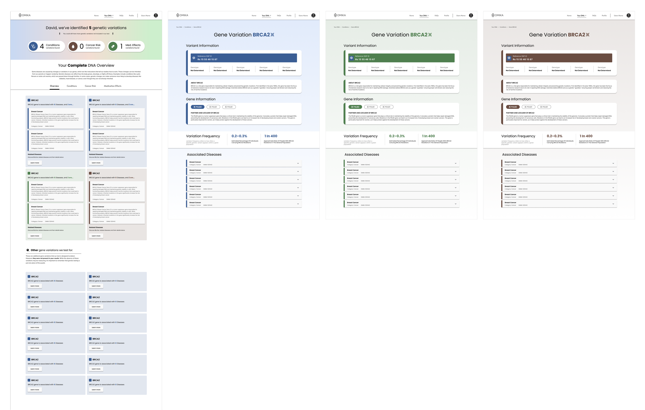
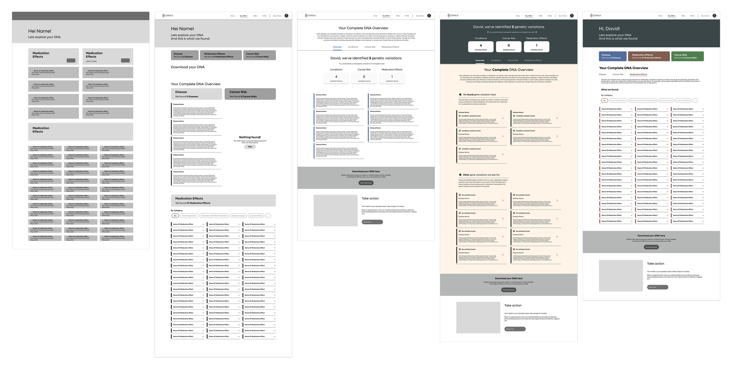
Pictured above: a quick glance of the Your DNA and Gene Variation section on Omikas new Webapp.
KEY DESIGN DECISIONS
Designing for an Evolving Information Architecture


Progressive Disclosure
Prioritized high-level summaries before allowing users to explore detailed genetic information.
Information Architecture
Organized complex genetic information into a clear structure that evolved alongside changing product requirements.


Visual Hierarchy
Used typography, spacing, and colour to help users quickly distinguish between key findings, supporting information, and recommended actions
Stakeholder Collaboration
Worked iteratively with stakeholders to refine layouts and navigation as the product vision evolved.
Pictured above: a quick glance of the proses from low to mid fidelity prototyping.
REFLECTION
Designing Through Uncertainty
Working in an early-stage startup meant designing for a product that evolved continuously throughout development. Rather than following a traditional UX process, success depended on rapid iteration, stakeholder collaboration, and adapting the information architecture as product requirements became clearer.
KEY TAKEAWAYS
🔄 Designing for evolving requirements
🧬 Simplifying complex healthcare information
⚖️ Balancing business needs with usability
♾️ Applying Lean UX in practice
OUTCOME
The final website and web application designs provided a scalable UX foundation for Omika's evolving platform, supporting both stakeholder goals and future product development.