
Omika Health
Omika Health is a startup focused on early disease detection using DNA screening and AI. I worked as a freelance designer to improve their website and make a web app, delivering a user-friendly, scalable experience aligned with the company’s vision and branding.
My Role:
Freelance Interaction Designer
Period:
October 2024 - Mars 2025
About project
The project included a marketing website and a web application, with the main challenge being the web app: presenting complex, sensitive health information in a clear and navigable way without overwhelming users.
What is the Goal?
The goal was to deliver a clear marketing website and an intuitive web application that allowed users to easily understand, navigate, and interact with health information
Website
The website clearly communicates the company’s identity and offerings through an accessible, user-friendly design aligned with the client’s vision.
WebApp
The web app focuses on presenting complex information clearly and consistently by improving readability, simplifying navigation, and reducing cognitive load.
The Design Process
I followed a Lean UX and rapid prototyping process, iterating on wireframes and rough mockups based on continuous customer feedback until design approval.
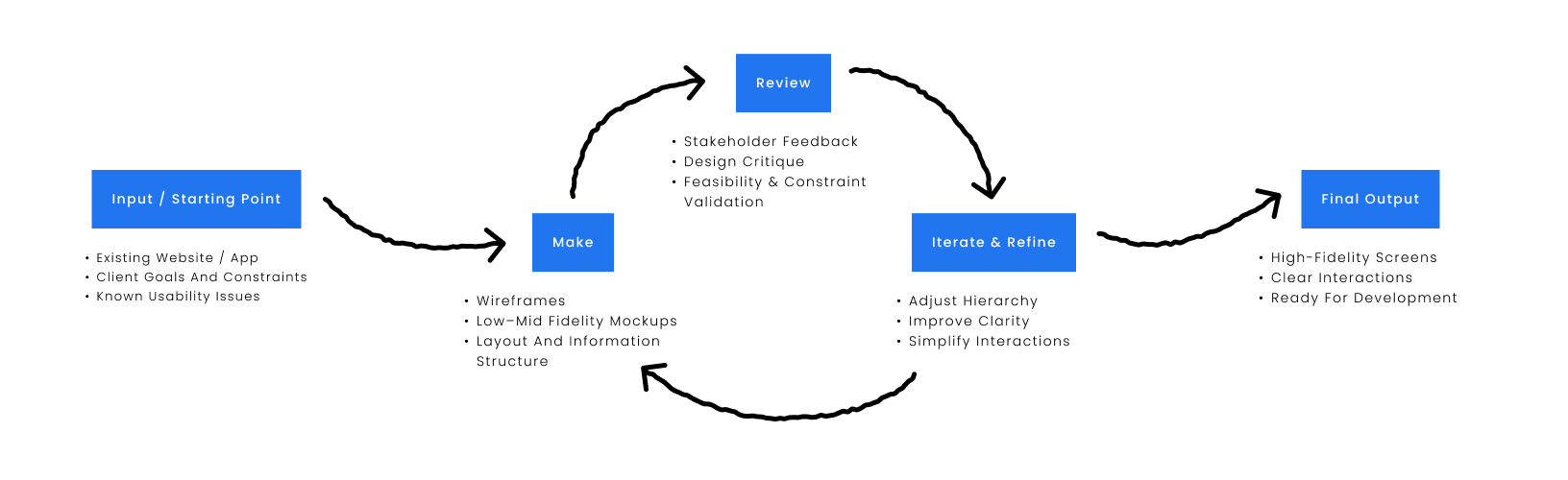
Validation was based on iterative stakeholder feedback due to project scope and timeline.
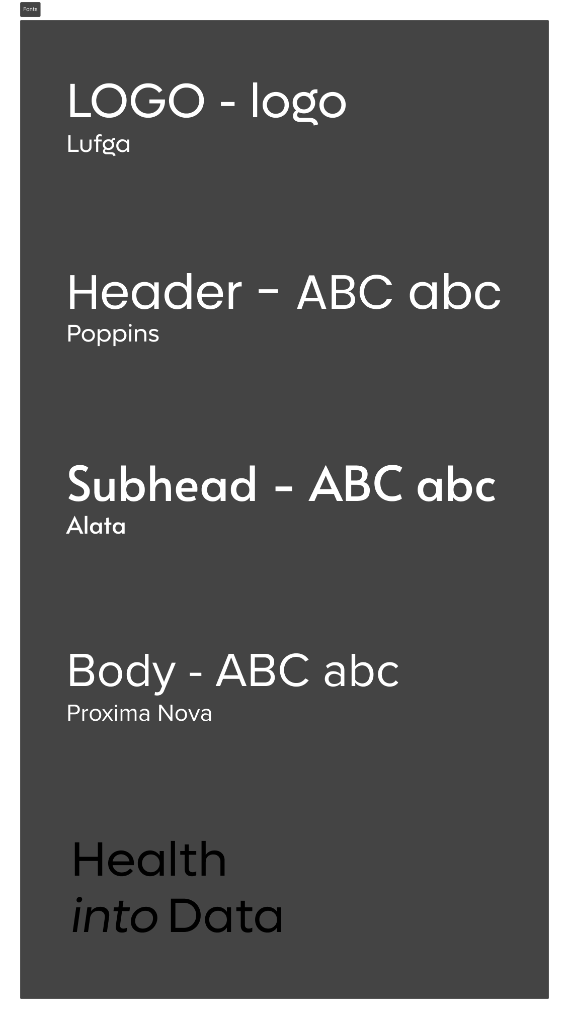
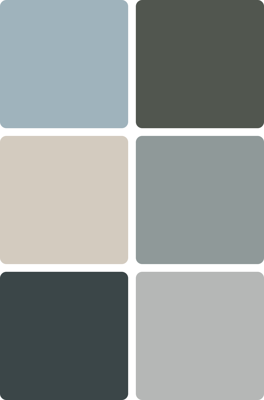
Brand OMIKA
The website and web app were designed using the client’s pre-selected fonts and established brand color palette, with flexibility to introduce complementary colors where needed to support usability and clarity.
WebSite
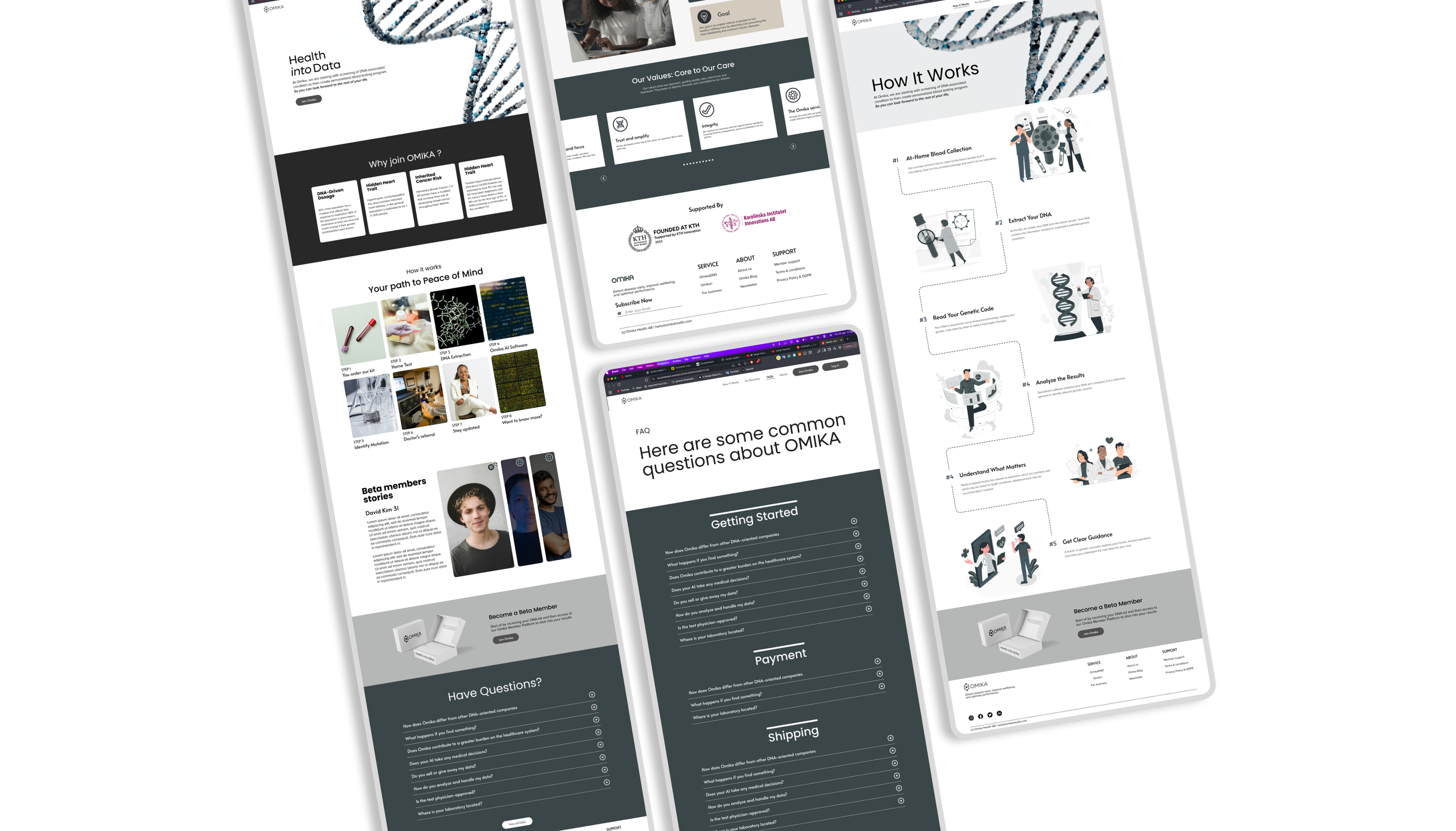
The goal of this project was to redesign the existing website into a more usable and polished solution that met the company’s immediate needs, while allowing for future iteration. The focus was on improving usability, structure, and visual clarity, with certain layout and content decisions shaped by specific client requirements.
Website pages
Home
How it works
For Business
FAQs
About Us
Extra pages/Elements
Pop ups - Newsletter and other
Log in page
Payment page
Package status
View the completed website: Omika
Low–Mid Fidelity Prototypes
Early prototyping focused on defining the layout and structure of key pages. Prototypes were used to gather early feedback, align on direction, and refine the design before moving into higher-fidelity work
Final look Website
Below is the final version of the website, developed through multiple iterations with the client
WebApp
The application presents DNA test results based on a submitted saliva sample. The app translates complex genetic data into a clear overview of DNA variations and their commonly associated conditions.
WebApp Goal
To clearly present DNA test results by highlighting detected DNA variations and their commonly associated conditions in an easy-to-understand format.
Challenges
Because the product was still being defined, early designs lacked a clear information hierarchy. Iteration revealed the need to center DNA variations, supported by stronger visual cues and simplified color usage.
WebApp Overview
The following images show the Low to High-Fi process for the web app.
High
Low
Mid
Star of Low - Fi
The goal of this phase was to explore how DNA results could be structured and navigated while the product definition was still evolving.
Result Categories
1.
Early concepts focused on grouping DNA variations into three categories: Medication Effects, Diseases, and Cancer Risk, reflecting the different types of impact DNA variations can have.
Content Constraints
2.
At this stage, it was unclear what information was appropriate or possible to show, as the data is sensitive and subject to medical and product limitations.
Layout & Navigation
3.
This phase explored how users might navigate between result categories and findings, including early decisions around page layout and global navigation patterns.
Low -fi overview
mid -fi overview
Refinements
During mid- to high-fidelity work, key product details were clarified, allowing the design to become more focused and concrete.
Category Definition
1.
“Diseases” was renamed to Conditions to better reflect the nature of the results and avoid overly strong terminology.
Result Volume
2.
It was confirmed that users typically have a low number of DNA variations (around 5 or fewer), which informed a more compact, focused layout.
Visual Category Indicator
3.
A visual element was introduced at the top of the page to clearly indicate which category a DNA variation belonged to. Color and text alone proved insufficient, so icons were added to improve clarity and fast recognition.
DNA Variation Cards
4.
Early cards displayed the DNA variation name, associated category, and brief context, with the option to view more details. Additional cards were later added to represent tested variations that were not found in the user, using clear titles and icons to distinguish them from detected results.
High-Fidelity
The high-fidelity prototype went through several iterations. Based on feedback and subsequent reflection, I determined that some elements were not working as intended.
Itirations
Version 1
Version 2
Version 3
Itirations - Elements
Page UI/UX Issue
The current version of the DNA Results page lacks clear visual guidance, which makes it difficult to understand how to interact with the content. The main issues identified were:
It is unclear which elements are clickable
Sections are not clearly associated with specific DNA variations
Visual hierarchy does not clearly guide attention between variations and related information
Text-heavy layout creates cognitive overload.

Final Refinements
Based on reflection and ongoing feedback, the DNA Results page was refined to improve clarity, reduce cognitive load, and better support the delivery of sensitive information.
Design Improvements
1.
Simplified the color system to create a calmer, more welcoming experience
Used color, icons, and layout to clearly indicate categories and interactions
Improved visual hierarchy to guide attention and scanning
DNA Variation Cards
2.
Shifted focus to the DNA variation first, rather than long condition lists
Highlighted only 1–2 associated conditions or effects
Clearly indicated that more details are available on the interaction
Variations Not Found
3.
Moved tested-but-not-found variations into a simplified list below
Reduced visual weight and text density for lower-priority information