

CASE STUDY
Norsk Tipping
Redesigning an underused feature through service design
Lucky Ticket was a highly requested feature, yet usage remained surprisingly low. During our internship we investigated why, identified the underlying problem, and designed a new concept to better support how people remember meaningful lottery numbers

My Role:
UX Designer

Period:
3 months
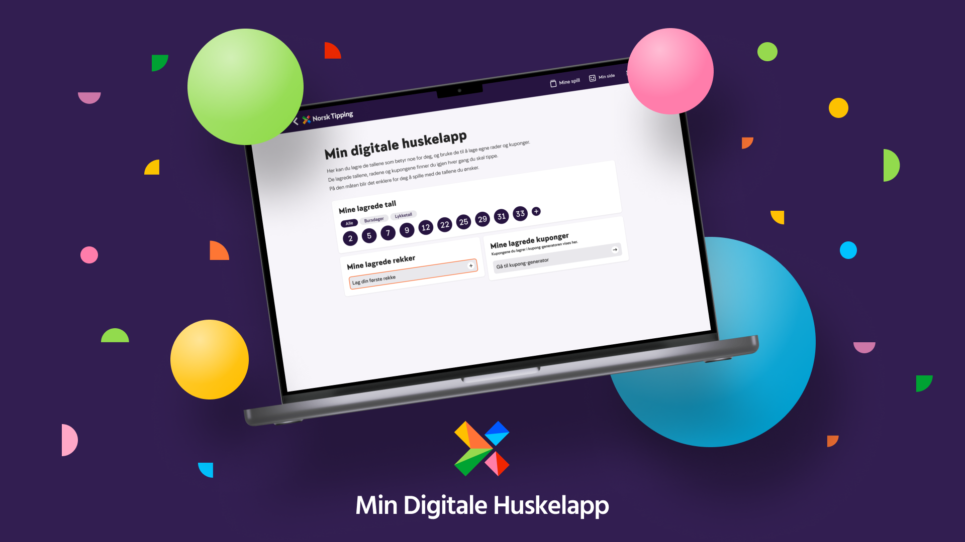
Before proposing solutions, we needed to understand how customers actually interacted with Lucky Ticket. Although it was one of Norsk Tipping's most requested features, adoption remained surprisingly low.

Challange
Lucky Ticket allowed customers to save their favourite Lotto tickets for future use. Despite solving a real customer need, the feature wasn't being used as intended.

Existing Persona
The project focused on Sentimental Sara, an existing persona who values meaningful Lotto numbers.

Our Goal
Discover why Lucky Ticket was underused and redesign the experience for saving, organizing, and reusing meaningful Lotto numbers.
THE CHALLENGE
Understanding the
Problem
A Deep Dive into Customer Behavior
To understand why Lucky Ticket was underused, we combined user testing, surveys, Hotjar, and Google Analytics. Together, these methods revealed four recurring behavioral patterns:
Awareness ≠ Adoption: Customers knew the Lucky Ticket feature existed and were able to save tickets, but very few returned to use it when purchasing new Lotto tickets.
Simplicity Drives Behavior: When placing a new ticket, customers consistently chose "Play Again" because it felt faster, simpler, and easier to understand.
The Feature Lacked Clarity: Many customers misunderstood what Lucky Ticket was for or where to find their saved tickets, creating unnecessary friction.
Customers Prioritized Convenience: Rather than following the intended workflow, customers naturally gravitated toward the quickest and most accessible option.
RESEARCH
Understanding Our Primary User
Our project built upon an existing persona, Sentimental Sara.
A customer with a strong emotional connection to her Lotto numbers. To better understand her needs, we studied users who shared similar motivations while also including participants with different behaviours and goals. This allowed us to distinguish Sara's specific needs from broader customer patterns.

RESEARCH
RESEARCH
Experience Map
We also created an Experience Map to identify pain points across the customer journey, helping us understand where confusion occurred before, during, and after saving a Lucky Ticket.
Understanding user flow
During usability testing with 12 participants, we asked users to save a Lucky Ticket and then use it to purchase a Lotto ticket. This is what we observed:
5 out of 12
Could not find their saved ticket under "My Games.”
6 out of 12
Searched for their saved ticket in the Hamburger Menu.
5 out of 12
Looked for their ticket under
My Page.
2 out of 12
Found their saved ticket in the "Lotto Lobby."
11 out of 12
testers successfully saved a lucky ticket.
9 out of 12
Needed 3+ steps to locate their saved ticket.
RESEARCH
KEY INSIGHT
11 of 12 participants successfully saved a ticket,
9 of 12
struggled to find it afterwards.
The issue wasn't functionality, It was:

Clarity

User Expectations

Navigation
Defining the Opportunity
Our research revealed that Lucky Ticket wasn't failing because customers couldn't save tickets. It was failing because they couldn't easily find or reuse them. This shifted our focus from improving the existing feature to rethinking how customers manage meaningful Lotto numbers.

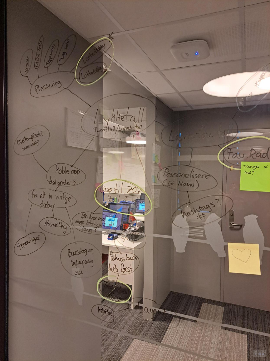
Picture above show How Might We and brainstorming session
DEFINE
Using How Might We, we explored several concepts before identifying the core issue:

Lucky Ticket was designed around saving tickets,
not the meaningful numbers behind them.
DEFINE
Paper Prototype
Before moving into high-fidelity design, we explored multiple layout concepts through paper prototyping. This allowed us to quickly evaluate different ideas and identify the strongest solution before investing time in detailed UI design.
Pictured above: Brainstorming and exploration of multiple paper prototype concepts.

Reduce Effort
No more rewriting the same numbers every time you play

Reuse Numbers
Save meaningful numbers and combine them into new sequences whenever you want.

Reuse Tickets
Save, revisit, and play your favorite tickets again at any time.
My Digital Reminder helps customers save, organize, and manage the Lotto numbers that matter most to them.
THE SOLUTION
My Digital Reminder
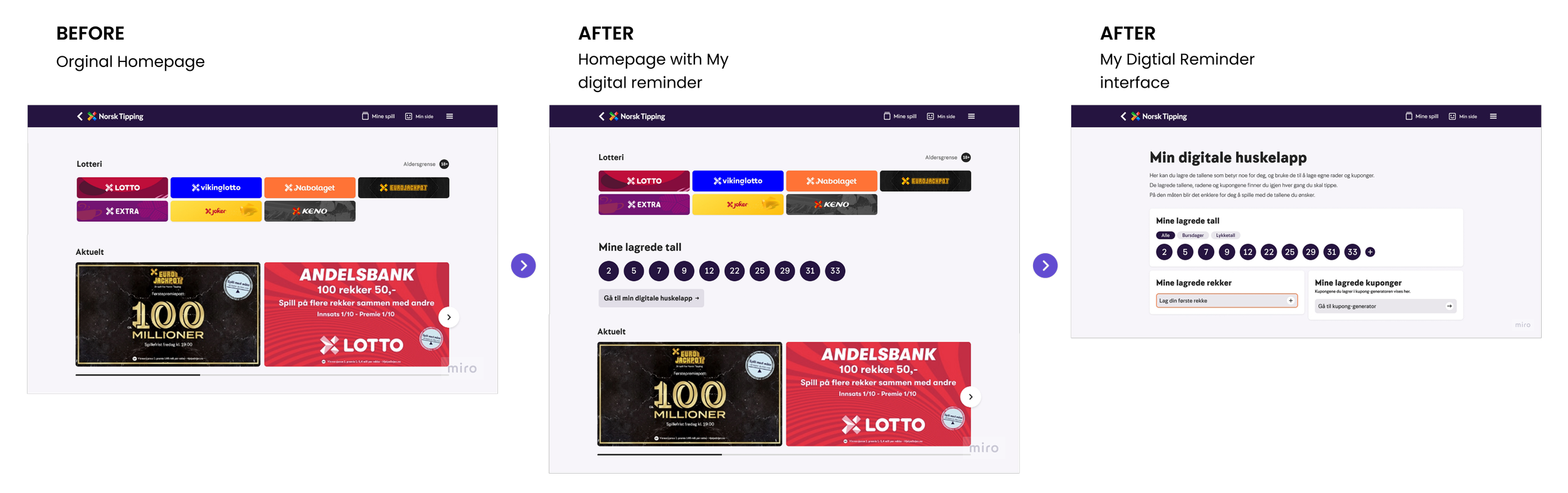
Pictured above: The original Lottery home page alongside the updated version with the new My Digital Reminder section
01. Physical to Digital
Research
Many participants used sticky notes or paper to remember their Lotto numbers.
Design decision
Digitize personal reminders so numbers are always available and easy to use.
THE SOLUTION
Key Design Decisions
These decisions were made to directly address the needs uncovered through our research.
02. Numbers Before Tickets
Research
Users are emotionally connected to individual numbers, not the ticket itself.
Design decision
Allow users to save individual numbers and combined tickets later.
03. Sorting & Filtering
Research
As collections grow, finding and reusing meaningful numbers becomes difficult.
Design decision
Use categories and filters to help users find, understand, and reuse numbers.
REFLECTION
What I learned
This internship gave me valuable experience applying UX and Service Design principles in a real-world setting. Throughout the project, I learned how to turn qualitative research and user insights into meaningful design decisions, while collaborating within an established product and design team.
Working closely with Norsk Tipping's designers also gave me a better understanding of how UX decisions must balance user needs, technical constraints, and business priorities.
Next steps
Due to time constraints, we were unable to conduct usability testing on the final prototype. If the project had continued, our next priority would have been validating the solution with users to answer questions such as:
Is My Saved Rows a valuable feature?
Is the overall concept intuitive and easy to navigate?
Does organizing numbers instead of tickets improve the user experience?
Feedback from the Norsk Tipping UX team also emphasized that a solution like this should be introduced gradually. Starting with saved numbers and validating adoption through iterative releases and A/B testing would reduce risk before expanding the feature further.